03 — Web Experience
Ambari Dashboard

Summary
A control plane for Apache Hadoop clusters, redrawn from operator pain points into a dashboard that ships in production today.
Intro
Apache Ambari, part of the Hortonworks Data Platform, lets enterprises provision, manage, monitor and secure Hadoop clusters. The Dashboard is Ambari's home — where operators detect problems and monitor cluster health.
I worked on it as both designer and front-end engineer alongside tech lead Yusaku Sako and PM Jeff Sposetti.

01 — Overview
Operating Hadoop without guesswork.
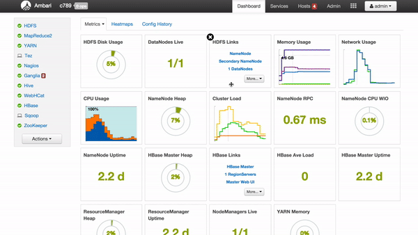
Apache Ambari gives operators an intuitive web UI to manage Hadoop clusters effortlessly — it takes the guesswork out of running Hadoop. The Dashboard is the home page where they detect problems and monitor cluster health.
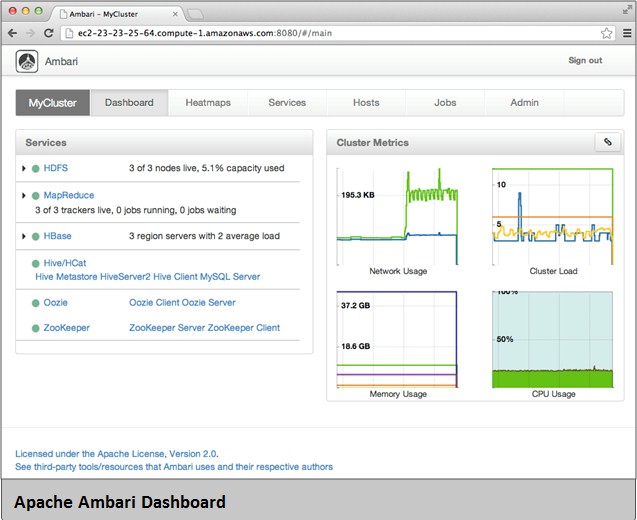
Before this work, service status (HDFS, YARN, etc.) was surfaced as plain text hidden inside tables. "It took me 30 mins before realizing the cluster was broken!" — a real quote from a real operator. The design goal was to visualize that data so the state of a cluster could be read in a second, the way a driver reads a car dashboard.
02 — Into the Design
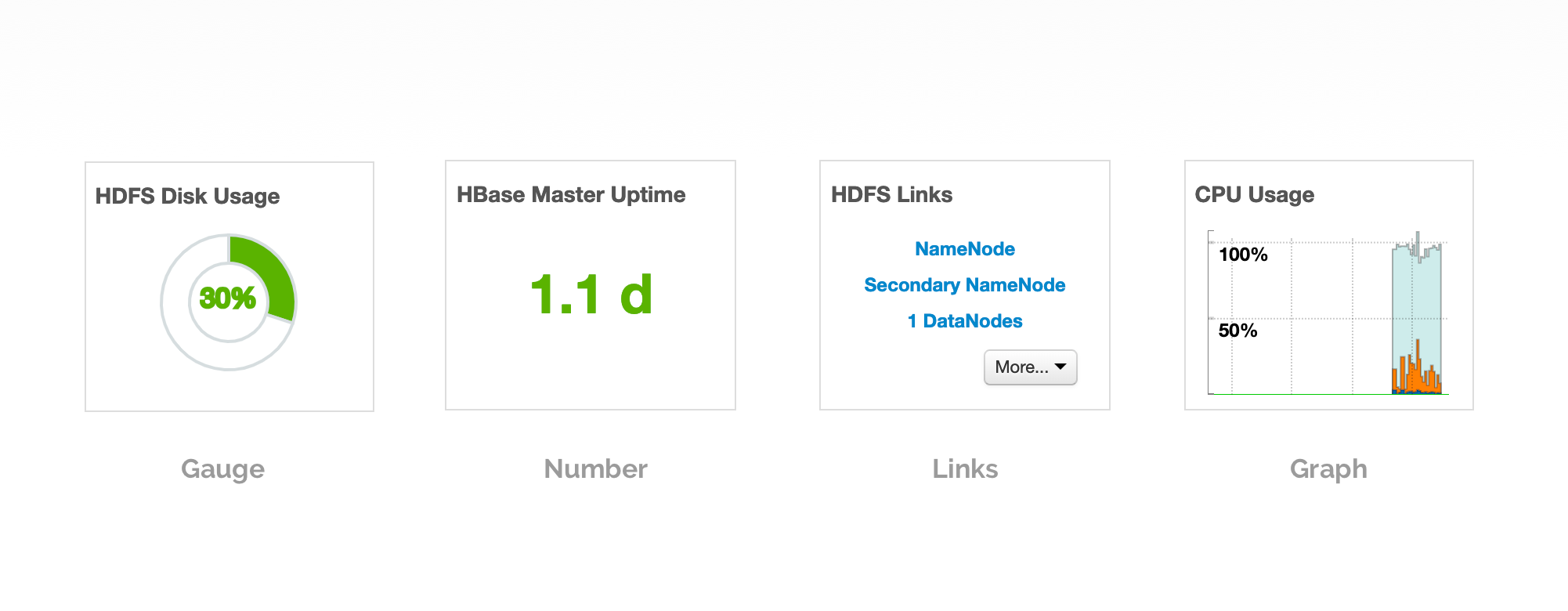
Four tile types, one grammar.
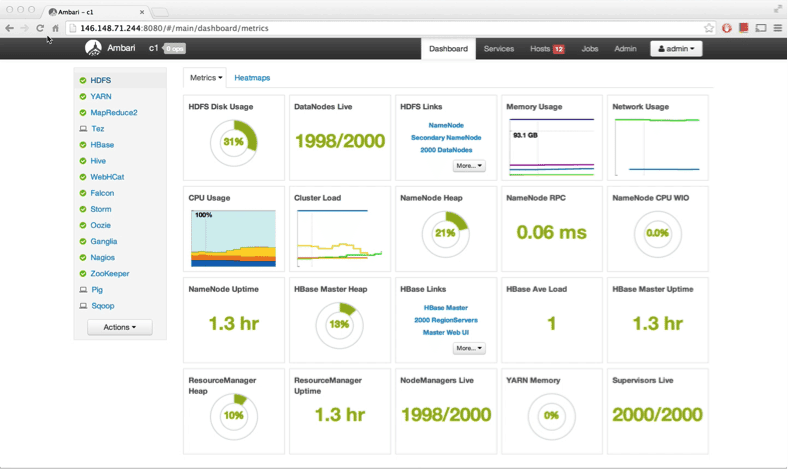
Texts were categorized into four tile types: Gauge, Number, Links, and Graph. Gauge and Number tiles took customizable color ranges — set a gauge red above 90% capacity and it announces itself across the room. All tiles are moveable by drag and drop.
Layouts went through several iterations. The final grid kept tiles draggable and reorderable while staying legible no matter how the operator arranged them. Sometimes less is more.
03 — Into the Details
Hovering reveals; clicking commits.
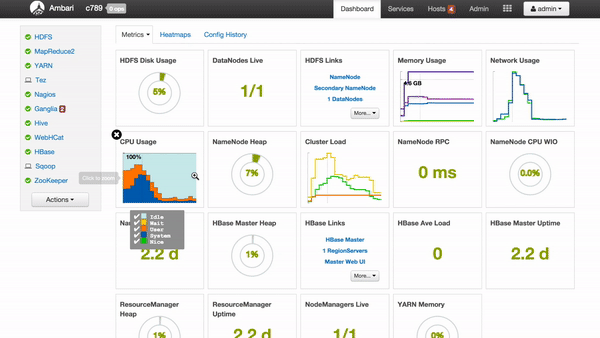
Tiles are more intuitive than plain texts, but light on context. So I surfaced more information on mouse hover — descriptions, actions, and the underlying data behind each metric. Video recording from live clusters.

Click a link, jump to the page.
Each link tile is a shortcut into a deeper view of that service. One click and the operator is exactly where they need to be.
Click a graph, zoom it in.
Graph tiles stay compact on the dashboard but expand on demand. A single click pulls the chart into focus without leaving context.
Customize tile colors — an early-warning system.
Customizable tile colors are a major feature of the design. Operators define the color range of a Gauge or Number tile, and once the data crosses into the danger zone, the tile turns orange or red immediately. A red gauge means something is wrong with the cluster — and you see it across the room.

04 — A Long-Term Story
Ambari 1.6 → 2.4 → still shipping.
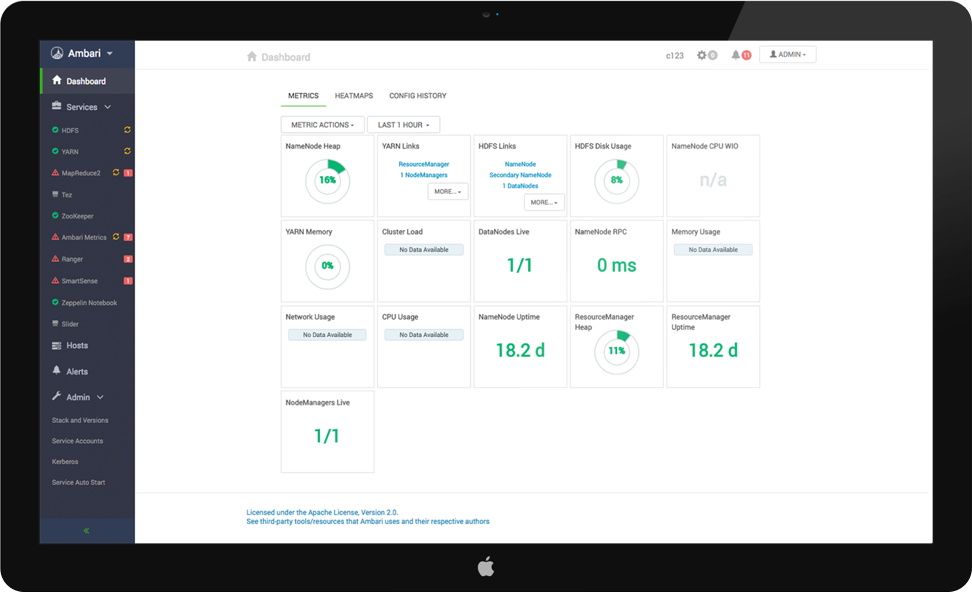
The new dashboard shipped in Ambari 1.6 in June 2014 and earned significant credit from customers. By Ambari 2.4 (2016) we paired the dashboard with a redesigned side menu.
Working as both designer and engineer on the same surface for four years remains the single most formative project of my career.