04 — Brand Identity
500 Water Bottles
Summary
A winning logo for the Hortonworks people community — chosen out of 60+ entries, printed on water bottles and shipped to 500+ employees.
Intro
An internal logo design competition at Hortonworks for the company's new People Community — an employee program celebrating the team behind the product. The brief was open to every employee; over 60 designs were submitted and one would be chosen to represent the community on merchandise shipped to the entire company.
The Brief
A mark for the people behind Hortonworks.
The People Community needed an identity of its own — something that lived alongside the official Hortonworks brand without competing with it, and that felt unmistakably about the employees rather than the product.
Submissions came from engineers, designers, marketers, and support staff. The winning mark would be printed on water bottles and distributed to 500+ employees worldwide as part of the program launch.
Inspiration & Design
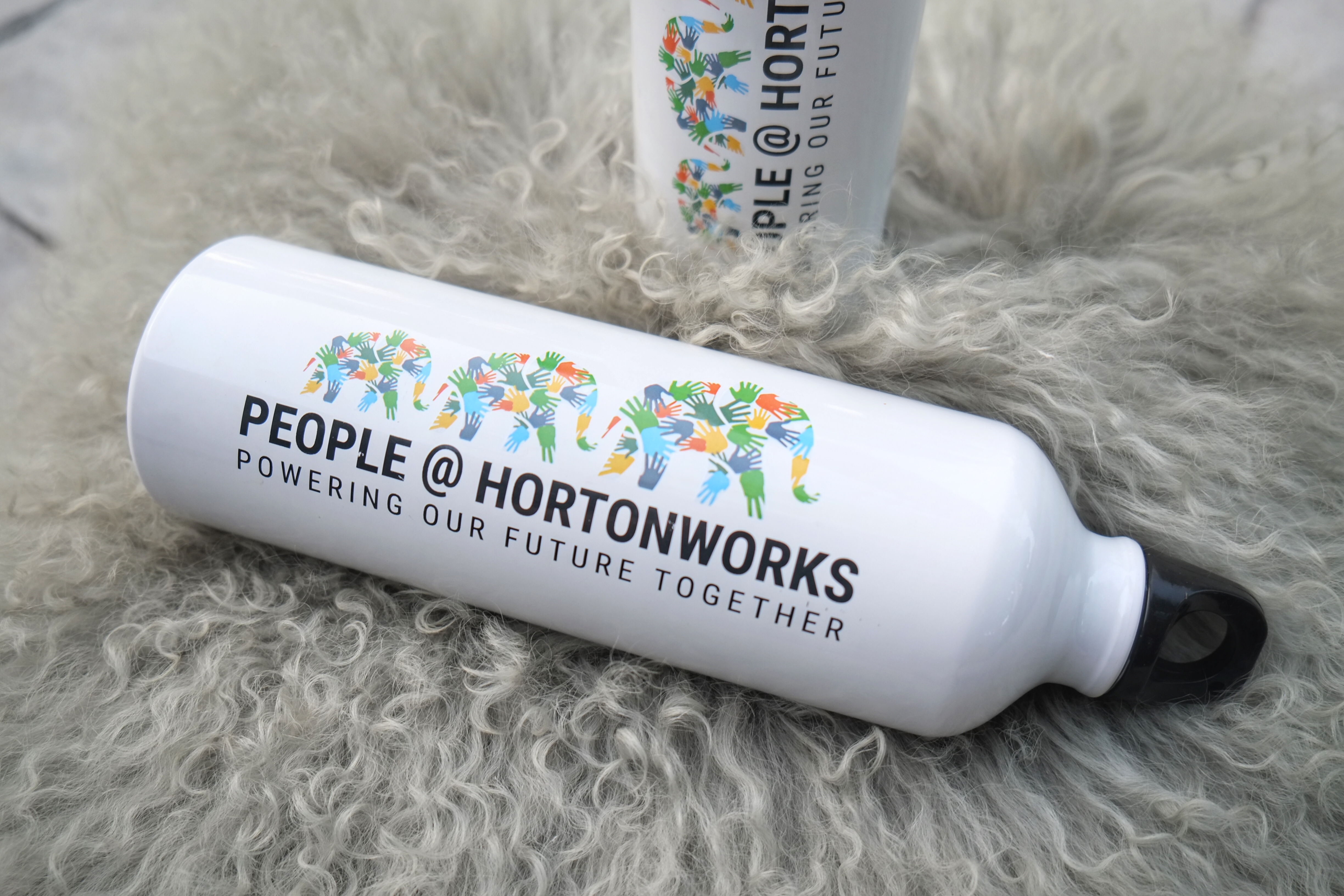
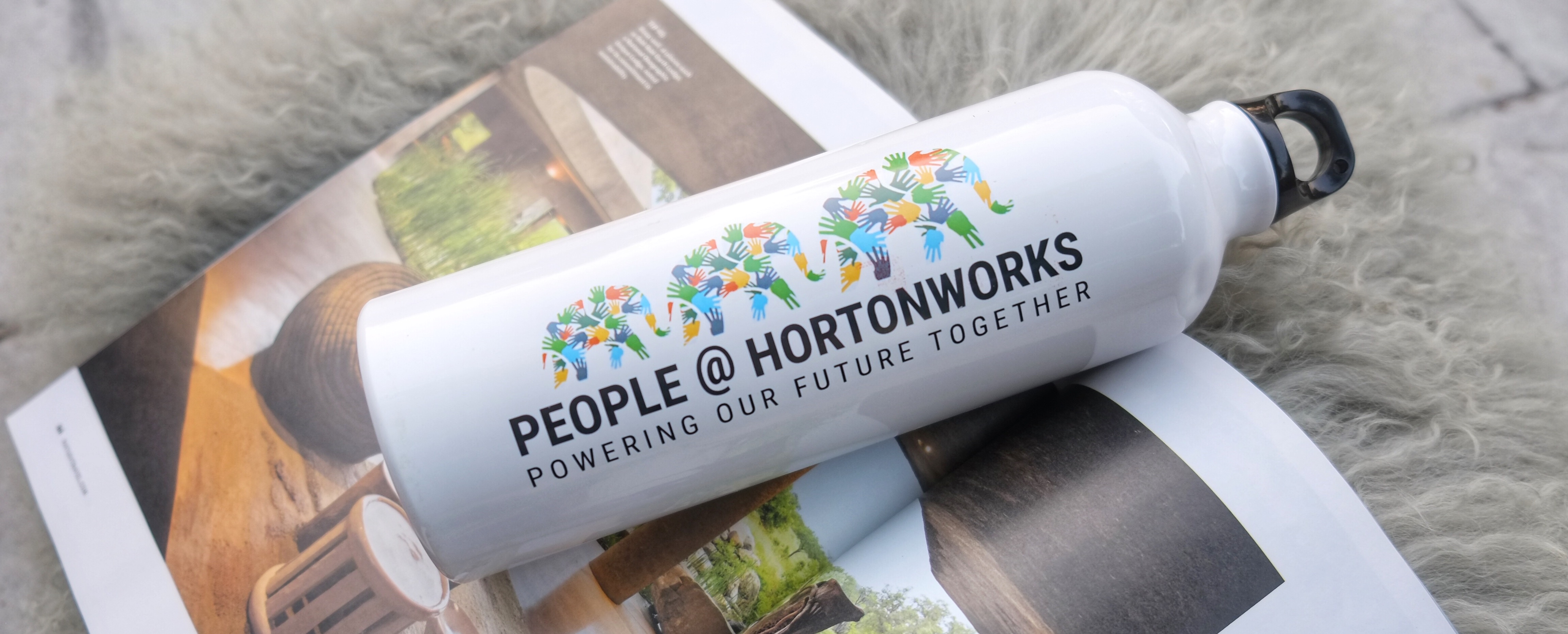
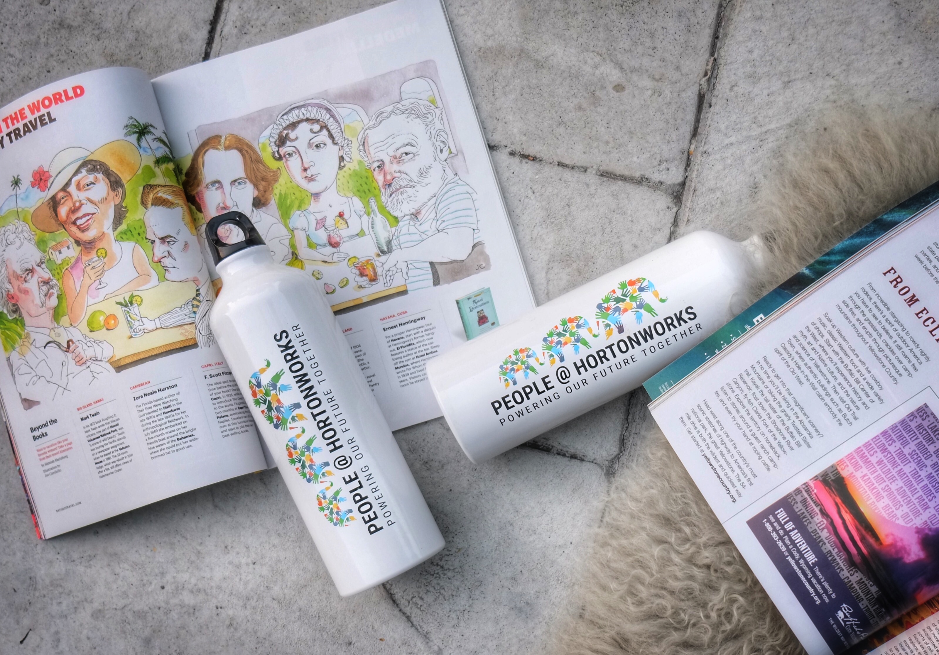
Diversity, drawn as hands.
We came from different origins, skin tones, disciplines, and cultural backgrounds — and we had collected ourselves into one company with one aim. I wanted the mark to make that visible rather than abstract it away.
The solution: hands in different sizes and skin tones, each one a real contribution. Arranged together, they assemble into the silhouette of the classic Hortonworks elephant — the company shape, built from the people inside it.
Every hand is individual and necessary; remove any one and the elephant breaks. The mark scales from a 24px favicon up to the curve of a water bottle without losing its weight.
Final Result
Chosen, printed, shipped.
The design was selected as the winner out of 60+ entries and produced as physical merchandise — printed on stainless steel water bottles and sent to every Hortonworks employee.