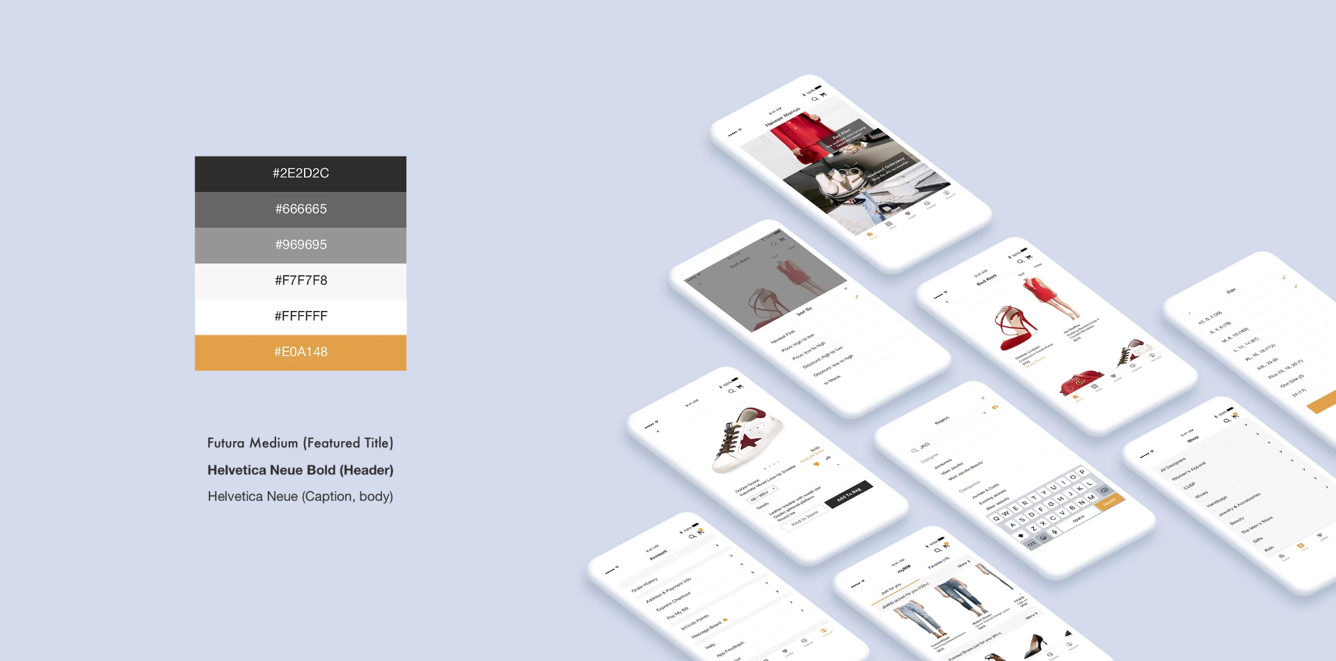
06 — Product Design
Neiman Marcus Redesign
Summary
An iOS redesign of one of America's most storied luxury department stores — calmer, faster, and finally worthy of the brand on the box.
Intro
A self-initiated redesign challenge for the Neiman Marcus iOS app, later published on Medium where it gathered 1.8k claps.
The work moves the experience away from cluttered e-commerce density toward gallery-grade composition — generous typography, a single accent, motion that announces nothing.
01 — The Challenge
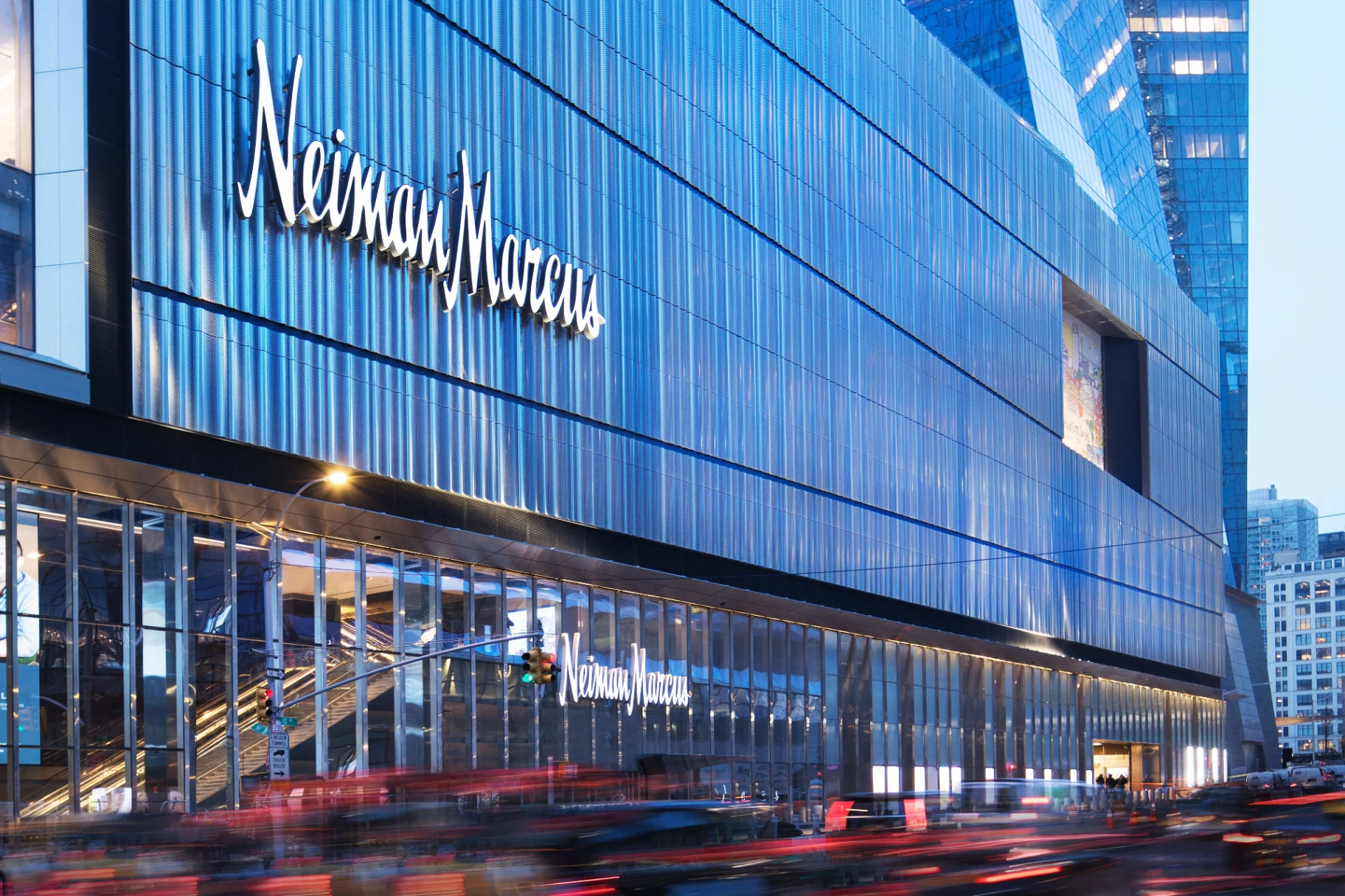
A high-end store, a low-end app.
Neiman Marcus operates 42 stores across the United States and is among the most prestigious luxury retailers in the country. Its iOS app, however, sat at 2.5★ on the App Store, with a top review reading: "A very low-end app from a high-end store."
I have always been a shopaholic. This was a design challenge I had wanted to take on for a long time.
02 — Research
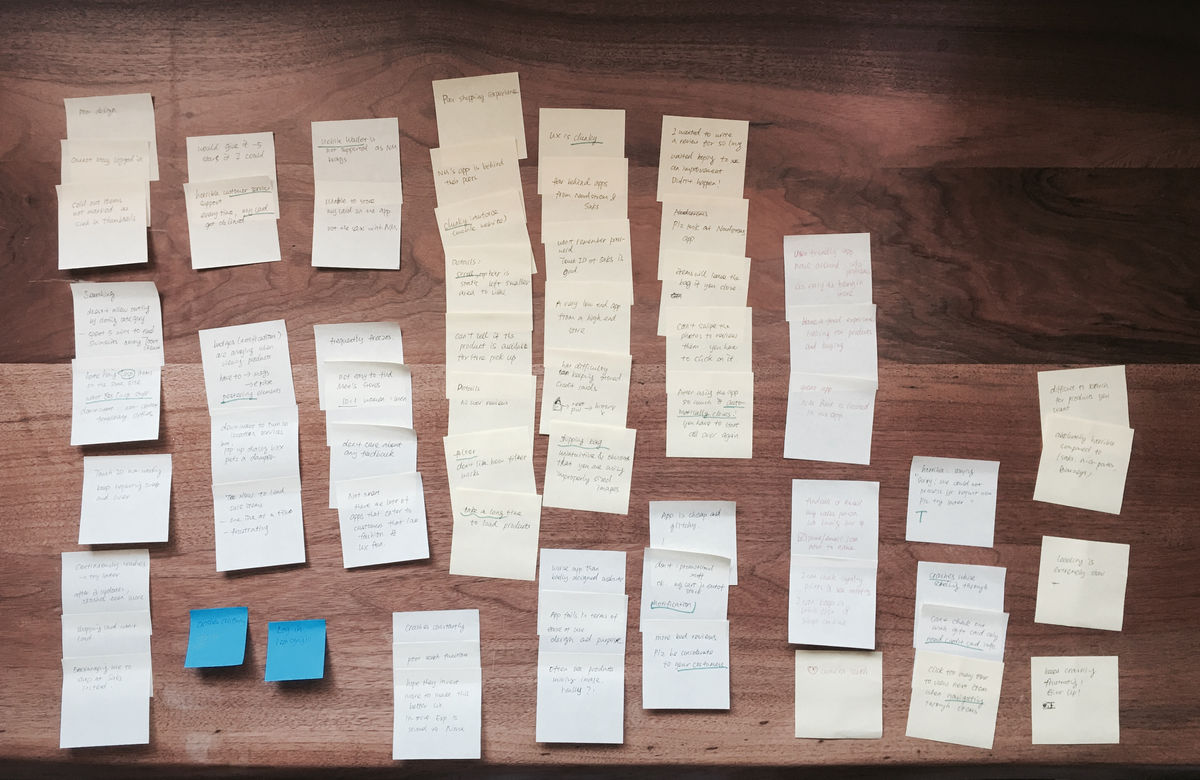
Heuristic evaluation + 200+ reviews.
I ran a heuristic evaluation against the live app (v8.4, Sep 2017), then clustered more than two hundred App Store reviews into affinity diagrams. The negative reviews were rich in detail and emotion; the positive ones were mostly tolerance from long-time customers.
Four problems surfaced repeatedly: clumsy and outdated UI, disorganized navigation, weak view / filter / sort, and a back-end that was slow, crash-prone, and out of sync with the web.


03 — Solutions
From four problems to four moves.
Each problem was answered with a concrete design move: simplify the UI around a contemporary typographic system; restructure navigation and regroup menu items; rebuild filtering, sorting and search; and design error and loading states that comfort the customer instead of blaming them.
From there I restructured the information architecture around three intents — Explore, Shop, and myNM — collapsing twenty entry points into three meaningful doors.
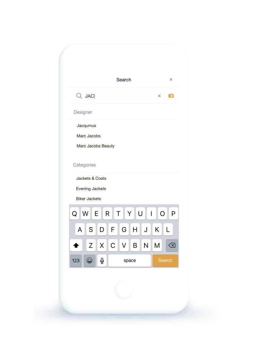
04 — UI Design
Explore, shop, refine — three doors instead of twenty.
Explore opens with editorial inspiration from Neiman Marcus's Instagram and The Book. Shop leads with categories and designer index. myNM gathers saved items and personalized picks tuned to taste.
Product lists hide the sort & filter bar on scroll-down and bring it back on scroll-up. Product details were regrouped to lead with the photography. Search picked up keyword suggestions, recent history, and camera search — surfaced, not buried.


05 — Beyond the Brief
Ideas outside the scope.
Cooperate with fashion bloggers and celebrities to curate featured collections, bringing NM into the conversation of contemporary fashion taste.
Invest in photography and styling. A $1,000 luxury garment should not look like a $100 piece. For e-commerce, how it looks is everything.
Listen back to customers — the app reviews are full of clear, ignored requests. User loss matters as much as user growth.