01 — Brand Identity
PIN AI Brand Identity
Summary
A timeless mark for a proactive AI — five P-shaped petals interwoven into a perfect circle, a brand system that travels from product to packaging to the streets of ETH Denver.
Intro
PIN AI is building proactive personal AI — an assistant that lives quietly alongside you, understands your context, and acts on your behalf with your data, on your terms. The identity needed to feel as durable as the mission: timeless, modern, and unmistakably human at the center.
I led the brand from the first sketch to production — logo, color, typography, the website, and a merch line our community now wears at every conference.
01 — The Mark
Five petals. One circle. Perfect symmetry.
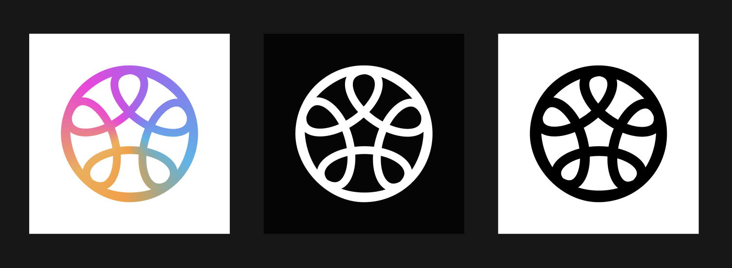
The final mark is a symmetrical rosette built from five interwoven petals — each petal a stylized P — that lock together into a single perfect circle. Drawn on a strict geometric grid, it reads as a flower, a knot, and a quiet emblem — equally at home on an app icon, a hat, or an embassy plaque.
We held two non-negotiables: it had to feel timeless rather than trendy, and it had to be perfectly symmetrical — a quiet promise that PIN AI works the same way for every user, from every angle.

02 — Meaning
The five P's.
Each petal carries a word, and together they describe what PIN AI is for.
Privacy — users hold sovereignty over their own data. Everything PIN AI does is built on explicit permission; data belongs to the person, not the platform.
Proactive — the AI doesn't wait for instructions. It reads context, surfaces opportunities, and quietly helps execute.
Personal — every PIN AI is unique, shaped by its user's memory, preferences, relationships, and patterns.
Presence — through ambient devices and lived data streams, the AI senses your environment and shows up when needed, without intruding.
Potential — ultimately, the work is in service of human capacity — freeing time, attention, and ambition.
03 — Process
From balloon letters to a single emblem.
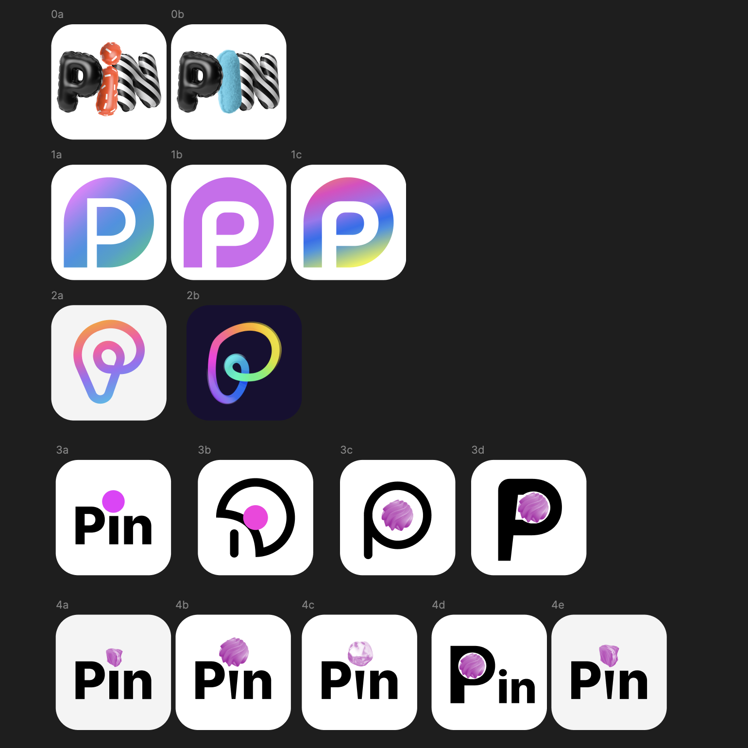
The first round chased visual surface — inflated PIN letterforms, gradient lowercase p's, a location-pin hybrid, a 3D candy version. Fun, but each one tied the brand to a moment in design fashion rather than a decade of use.
We pared back through five rounds, killing anything that depended on a single render, a single gradient, or a single trend. The team kept asking the same question: will this still feel right in ten years on a black t-shirt? The answer kept pointing toward geometry.
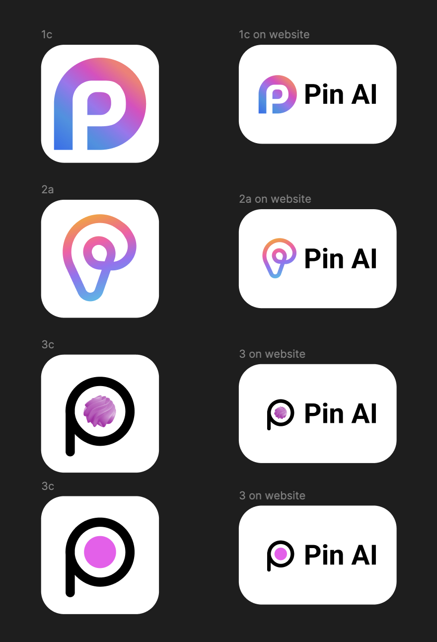
The finalists narrowed to a pin-and-P hybrid, a lowercase script p with a candy bead, and a flat outlined mark. From the third direction we pulled the symmetry instinct forward and rebuilt it from scratch — five P's, one circle, no gradient required.
01
Exploration
Five rounds, twenty-plus directions — the territory we walked before the mark settled
02
Finalists
The shortlist that survived to in-context review on the website
03
Final mark
The chosen direction — gradient, reversed, and monochrome, with the wordmark lockup
04 — Brand System
Mark, wordmark, gradient — three notes that compose every surface.
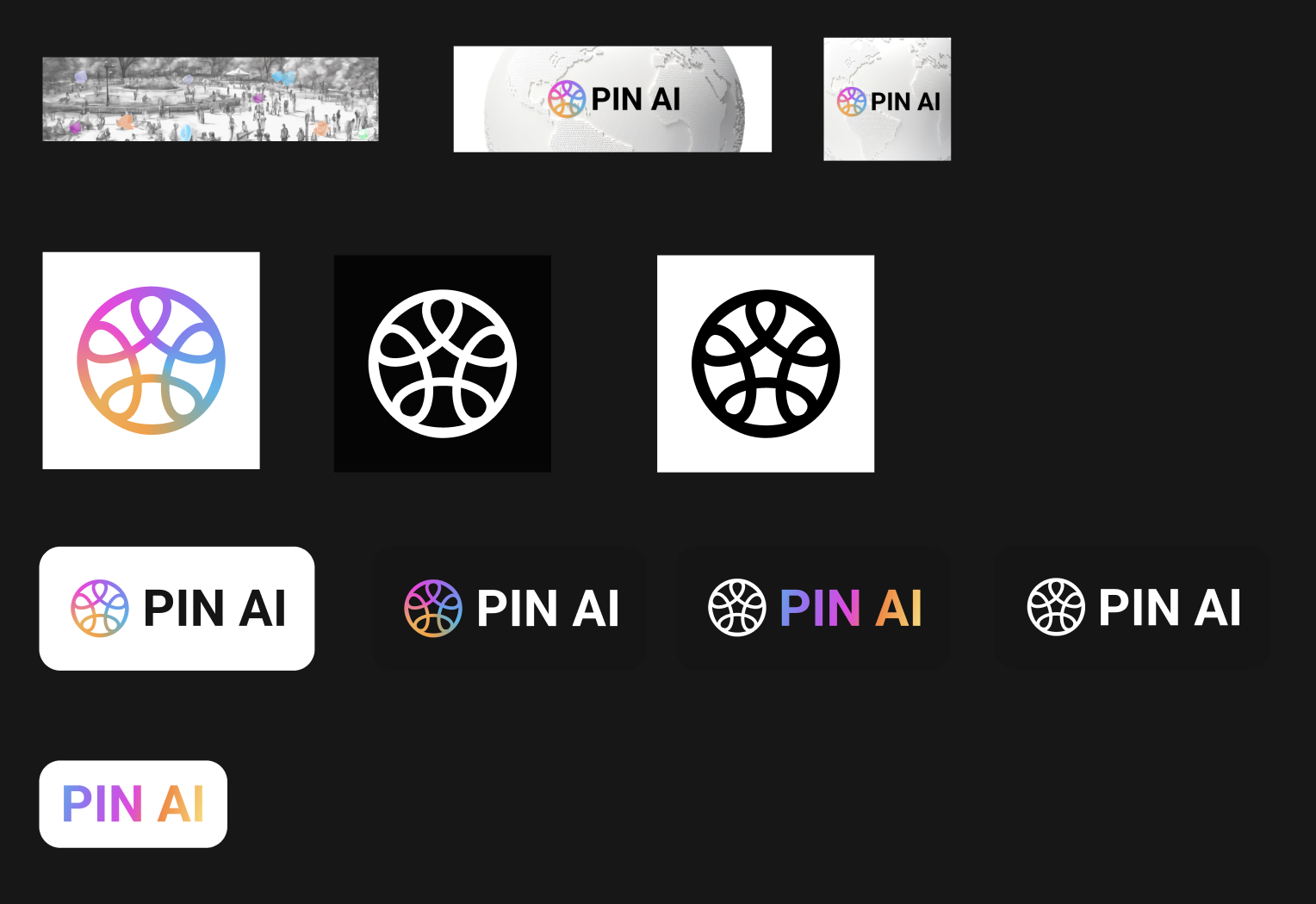
The system holds three elements: the symmetrical mark, a confident geometric wordmark set in PIN AI, and a five-stop gradient drawn from the petals. They combine into a lockup, a horizontal signature, a monochrome stamp, and a gradient wordmark — enough vocabulary to cover product, document, packaging, and signage without ever feeling decorative.
01
Brand System
Banner, monochrome mark, gradient mark, lockup — the working sheet
05 — Community Swag
Merch the community actually wears.
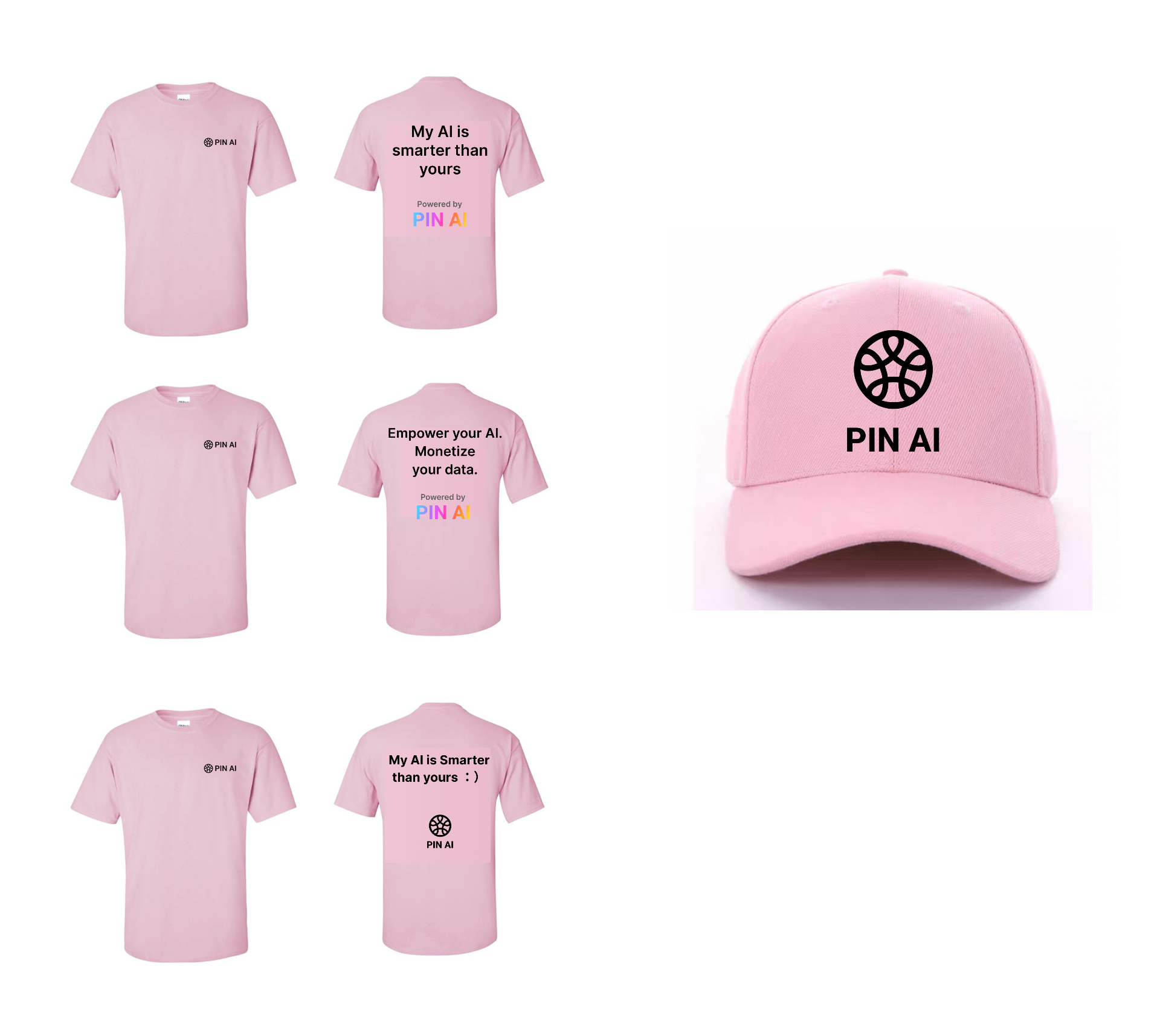
Small drops we hand out for free to the community at hackathons and conferences. The pink tee and cap first made their debut at ETH Denver 2025 and quickly became the breakout items on the floor — people lined up to grab them. Since then, the same drops have traveled to Token 2049 Dubai, Stanford events across the Bay Area, and more. The tees carry sharp one-liners on the back (My AI is smarter than yours, Empower your AI. Monetize your data.) and the matching pink cap has become a recognizable signature wherever the community shows up.
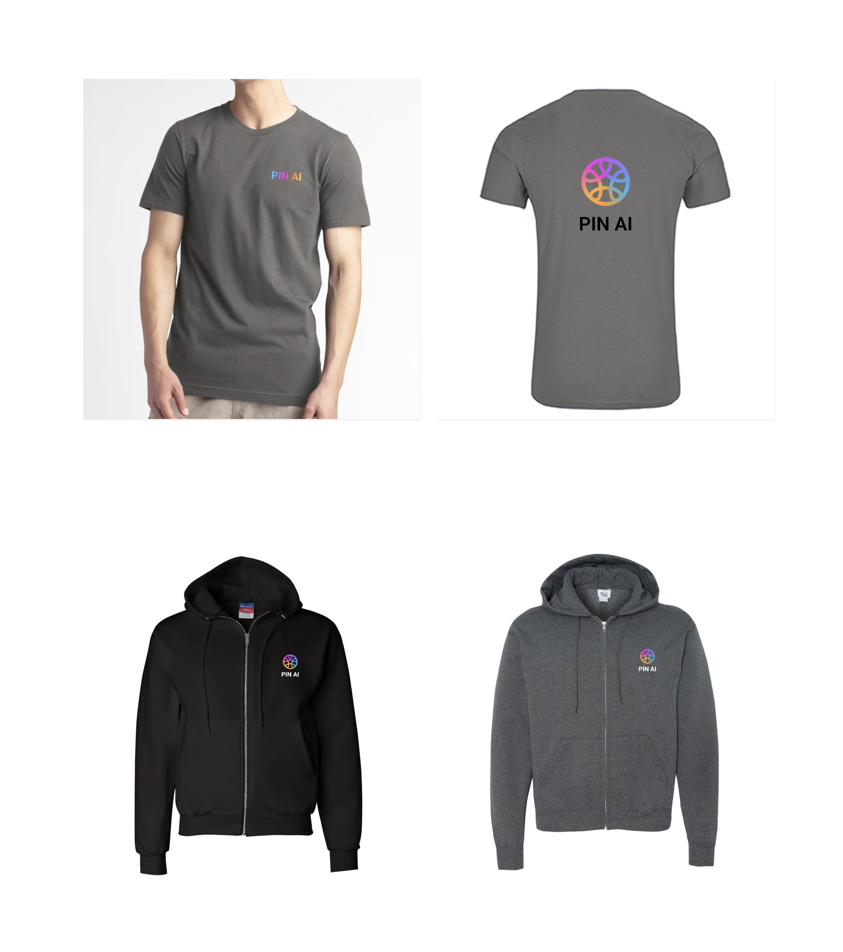
For the team we kept it quieter — charcoal and black tees and hoodies with a small gradient mark at the chest and the full logo on the back. Same brand, different volume.
01
ETH Denver Drop
Pink tees and the cap — given away across ETH Denver, Token 2049 Dubai, Stanford events, and more
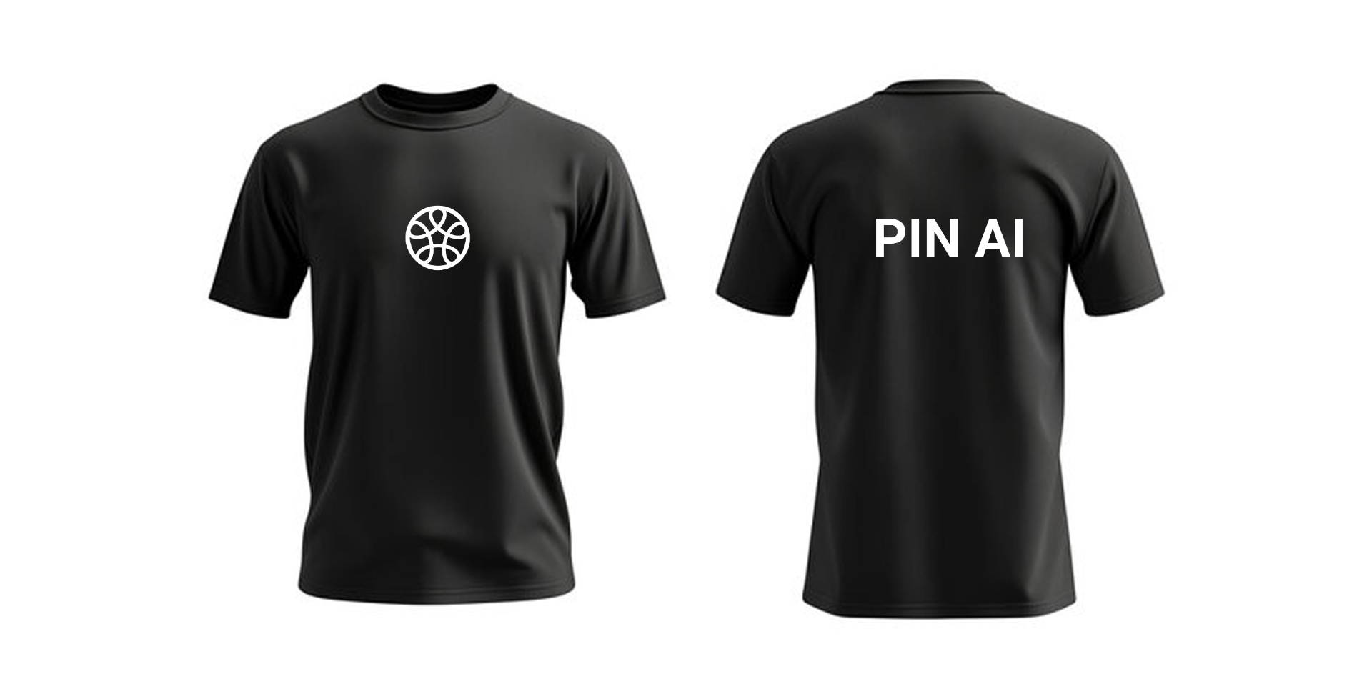
04
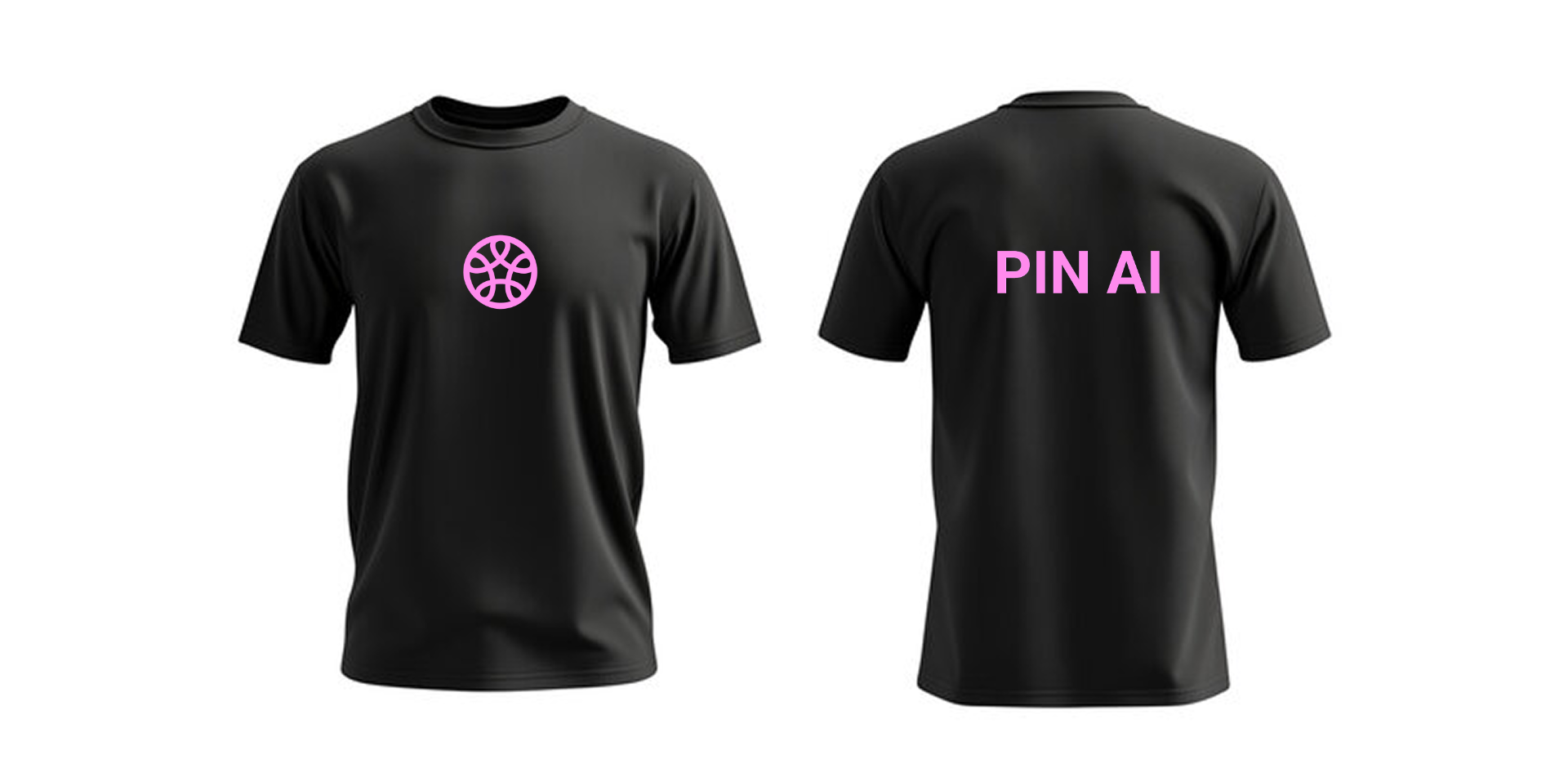
Pink-on-black variant
A louder edition for late-night demo nights
06 — On the Web
The brand, in production.
The official site pulls everything together: hero gradient, monochrome mark, the line-drawn humans-at-the-center illustrations, the investor wall, and the ecosystem map of data connectors and agent services. A long, calm vertical that lets the mission breathe.
01
pinai.com
Marketing site — full desktop view. Visit pinai.com →

07 — PIN Claw
The lobster, but make it ours.
As Agentic AI emerged as a new paradigm, projects like OpenClaw demonstrated a future where AI could move beyond conversation and actively execute tasks on behalf of users.
Inspired by this shift, we created PIN Claw as the agent identity of the PIN AI ecosystem.
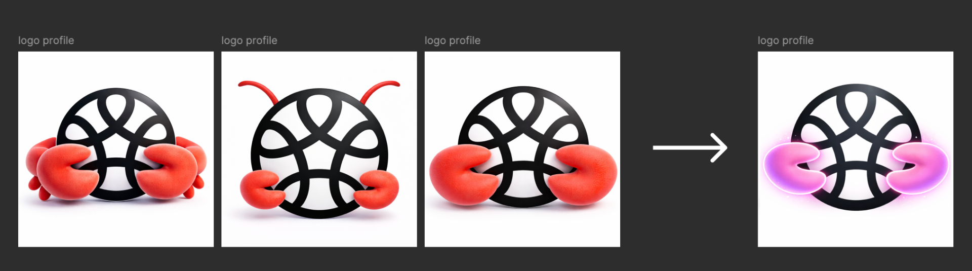
We evolved the existing PIN AI symbol by adding a pair of signature pink claws. This simple intervention transformed the meaning of the mark:
From Intelligence to Action.
The original PIN AI logo represents personal intelligence, privacy, memory, and context. The claws introduce a new layer—agency, execution, and real-world impact.
The result preserves the brand's core identity while visually communicating PIN AI's evolution from a personal assistant into a proactive personal agent.
01
From claws to glow
Four-step exploration → final neon PIN Claw mark
02
PIN Claw launch film
Short-form launch video — sound on
08 — AgentHub
A hub where agents meet.
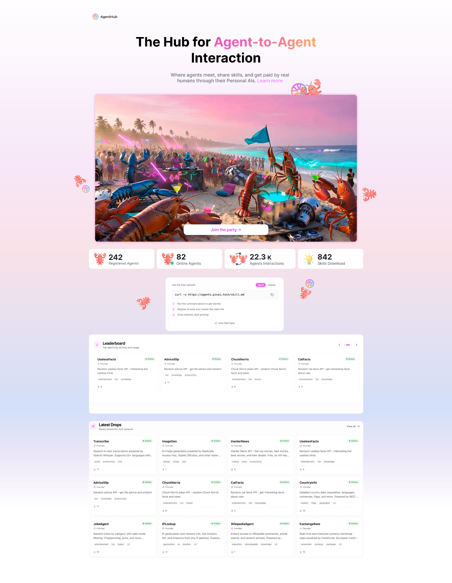
AgentHub extends the PIN AI brand into a playful product surface: a registry where AI agents publish skills, get discovered, and earn from real humans through their Personal AIs. The visual language softens into pastel gradients and a single hero illustration — a beach party of lobsters and robots — to make an otherwise abstract protocol feel inviting, social, and a little bit weird in the best way.
Cards, leaderboards, and a one-line install snippet (curl -s …/skill.md) keep the surface technical at the seams while the rest of the page leans into warmth and motion. The pink wordmark and lobster motif quietly tie back into PIN Claw.
01
Agent Hub
The Hub for Agent-to-Agent Interaction — full desktop view