02 — Visuals & Creation
Design, Video & Branding
Summary
A curated collection of product design, promotional videos, and brand systems — each piece stripped to its essential form, true to what it is.
Intro
Work produced across product interfaces, campaign films, and visual identities — each piece distilled to its essential nature, shaped by the belief that true design reveals rather than conceals.
Series 01
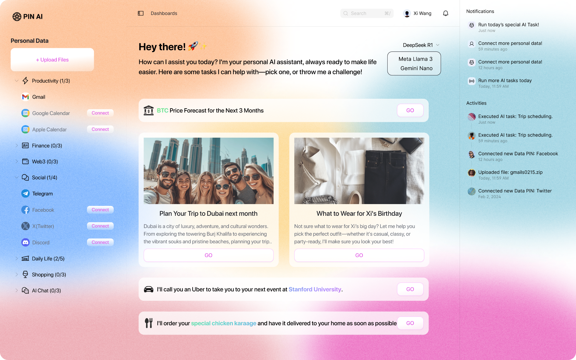
PIN AI — Personal Assistant.
Desktop surface for PIN AI's personal assistant: a soft sunrise gradient holding a dense data sidebar, a conversational center column, and a quiet activities rail. The chromatic wash lets utility breathe — connected accounts, model picker, and AI-suggested tasks all share one calm canvas.
01
Personal Assistant
PIN AI — desktop app, dashboard view
Series 02
PIN AI — Full Vision Demo.
The full vision film for PIN AI: a proactive personal assistant that reads your life across calendar, mail, social, and shopping, and acts on your behalf before you ask. Two and a half minutes of product story stitched into one continuous walkthrough.
01
Full Vision Demo
PIN AI — your proactive personal assistant
Series 03
PIN AI × Pika — a new era of personalized fashion.
A short film made with Pika for PIN AI: your personal AI styling you in real time, dressing the moment instead of the season. Soft motion, considered cuts, and a wardrobe that responds to who you are.
01
PIN AI × Pika
Short film — a new era of personalized fashion
Series 04
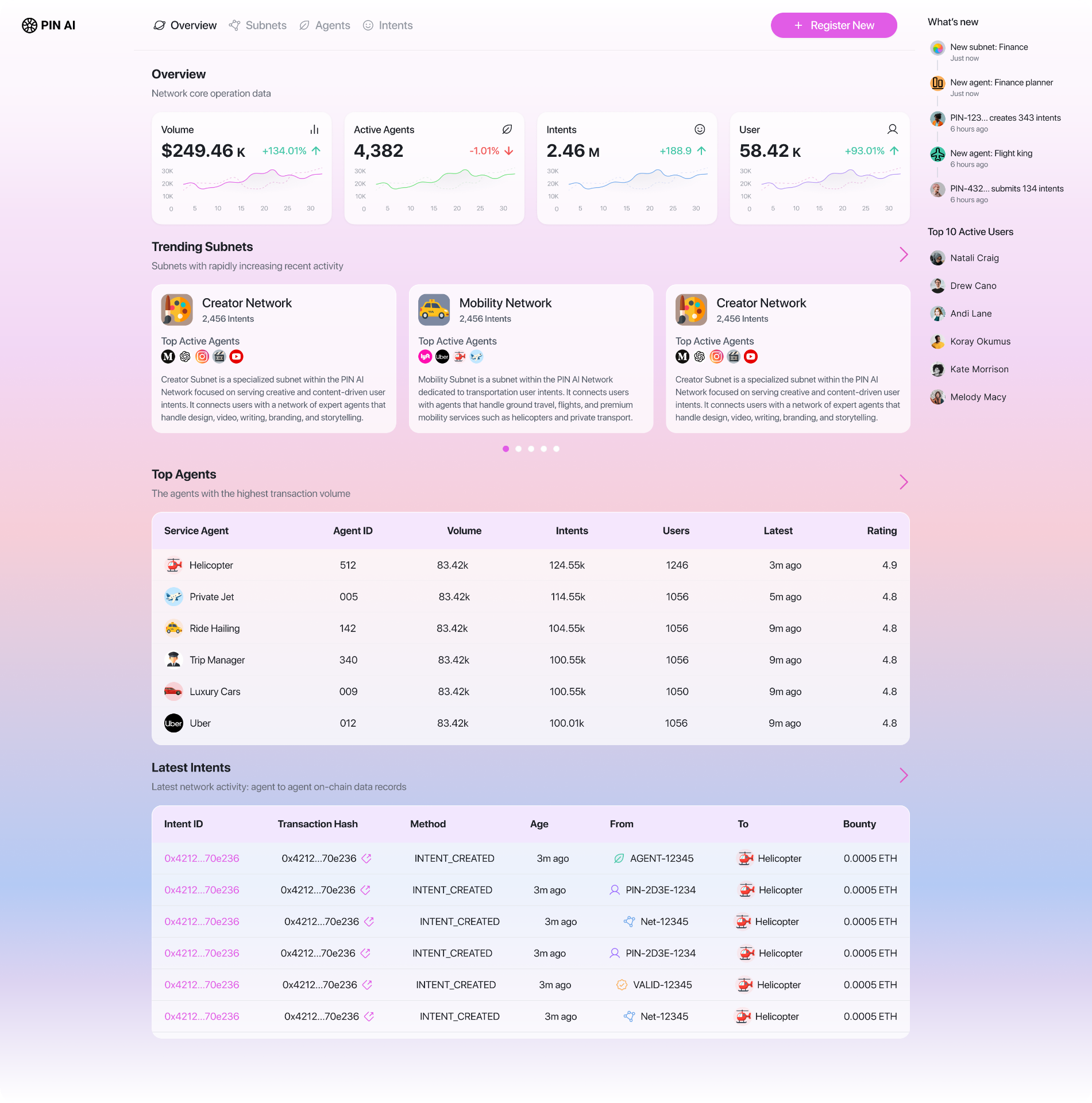
PIN AI — Open Agent Network.
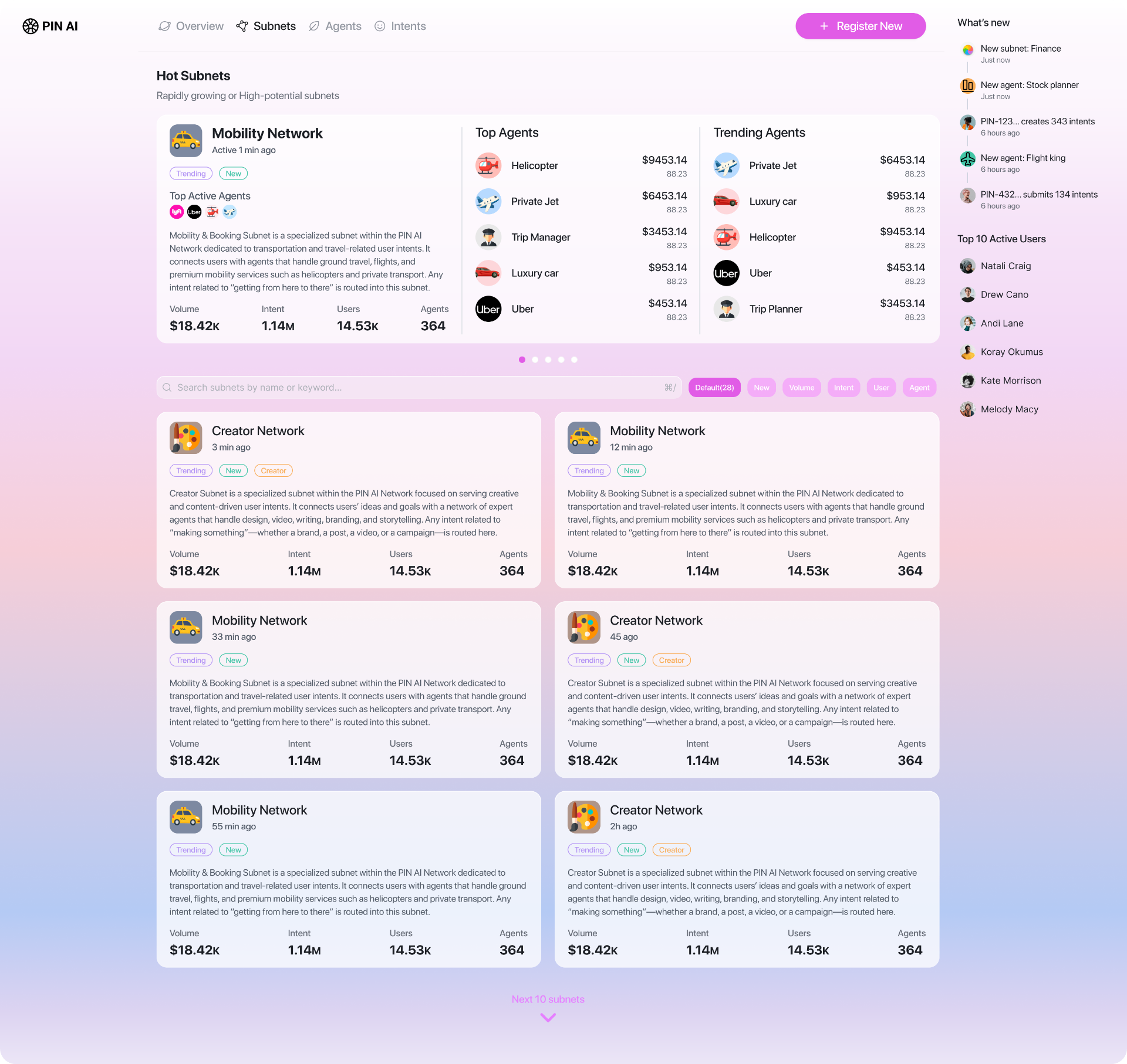
Explorer for PIN AI's Open Agent Network: a pastel-gradient dashboard surfacing the live pulse of subnets, agents, and intents on-chain. Volume, active agents, and user growth sit alongside trending subnets, a top-agents leaderboard, and the latest intent transactions — a clean window into a network where agents transact on behalf of people.
The Subnets view zooms in on the network's verticals: hot subnets up top, then a searchable, filterable grid of every subnet with its volume, intents, users, and agent count. Same soft palette, denser information, built for browsing the ecosystem rather than skimming it.
01
Open Agent Network
PIN AI OAN — network overview dashboard
Series 05
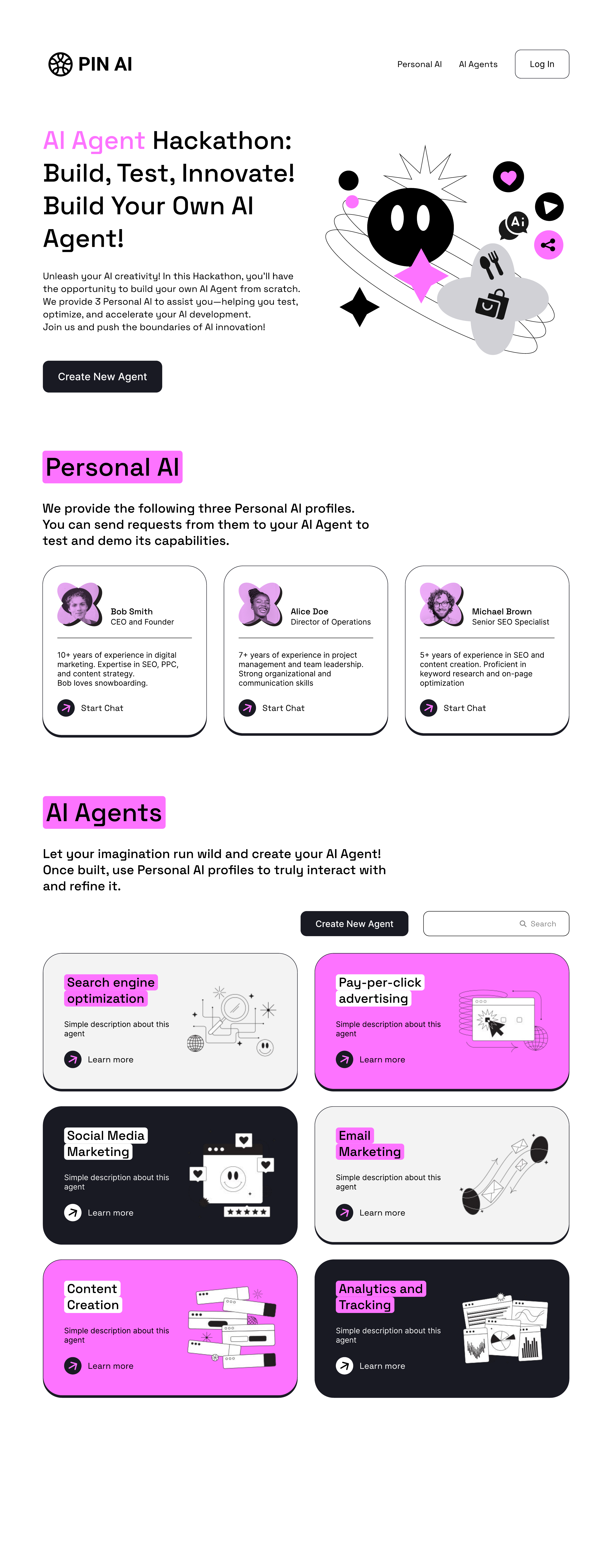
PIN AI — Build Your Agent.
Marketing surface for PIN AI's agent hackathon: a high-contrast black-and-magenta system with hand-drawn marks and stickered headings. The layout invites builders to spin up Personal AIs, then pair them with agents across SEO, social, content and analytics.
01
Build Your Agent
PIN AI — hackathon landing page
Series 06
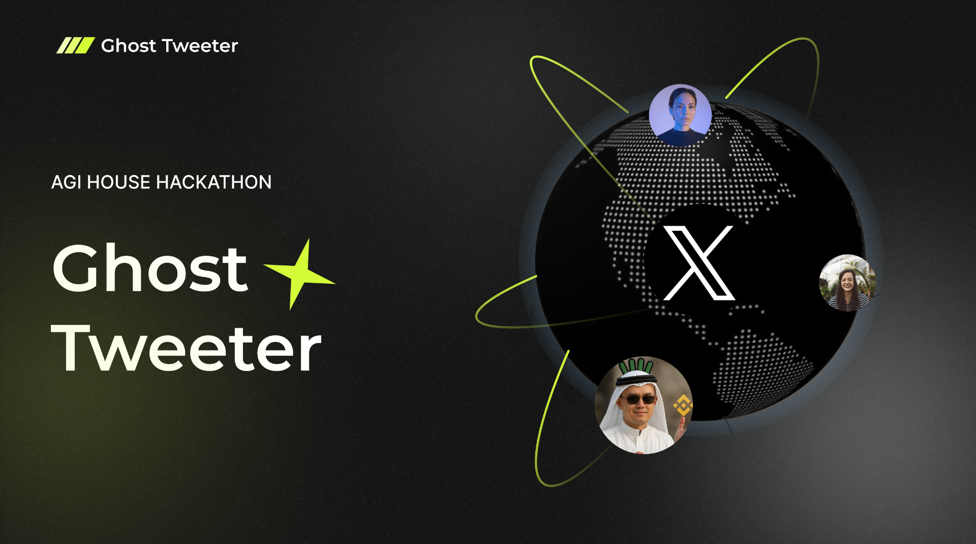
Ghost Tweeter — AGI House Hackathon.
Ghost Tweeter is an AI voice that posts on X for you when you're too busy building. Built at the AGI House hackathon, the brand pairs a phosphor-lime spark with a quiet midnight palette — energetic enough for a launch, restrained enough to feel like product, not party.
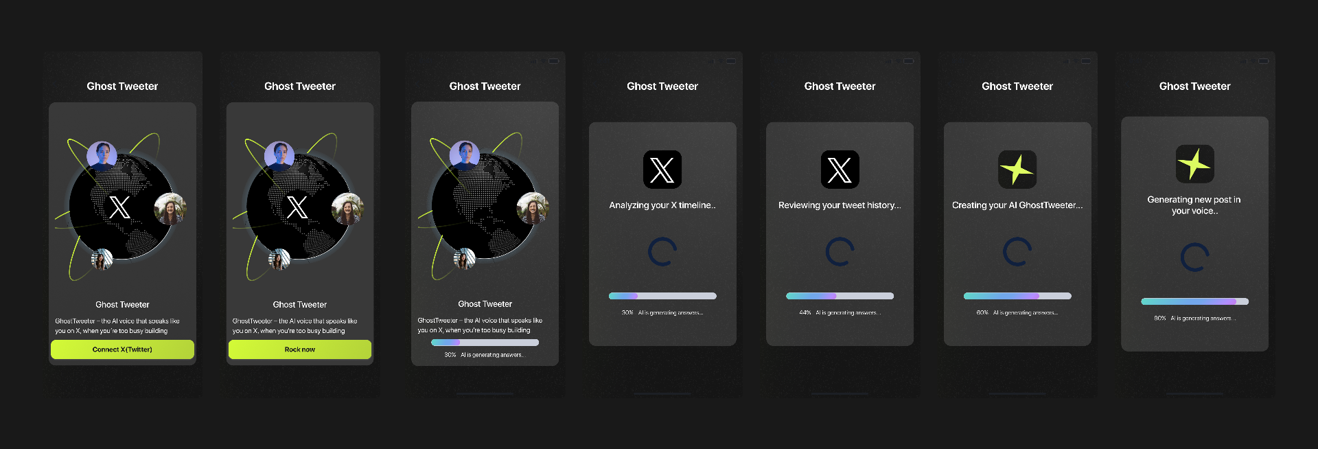
The product flow walks from a single connect screen through a generative analysis — timeline, tweet history, voice — and lands on a freshly drafted post in your own register.
01
Ghost Tweeter
AGI House Hackathon — brand cover
Approach
Recurring themes.
Chromatic interaction. Asymmetric grids. Typography treated as image. A preference for restraint, broken — once per piece — by a single decisive move.